
Walnut: A Dark, Warm Desktop Palette
Walnut is the look I built for my Linux desktop: near-black with a brown cast, one copper accent, line-drawn icons and a contour-map wallpaper. Here is the palette and the rules behind it.
I moved my workstation to CachyOS this month, and for the first time in years I had a desktop I wanted to look at. So I gave it a look of its own. I call it Walnut: a near-black desktop with a brown cast and a single copper accent.
This post is about the look itself: the colours, the rules behind them, and how they carry across a whole machine. It is not a config walkthrough.
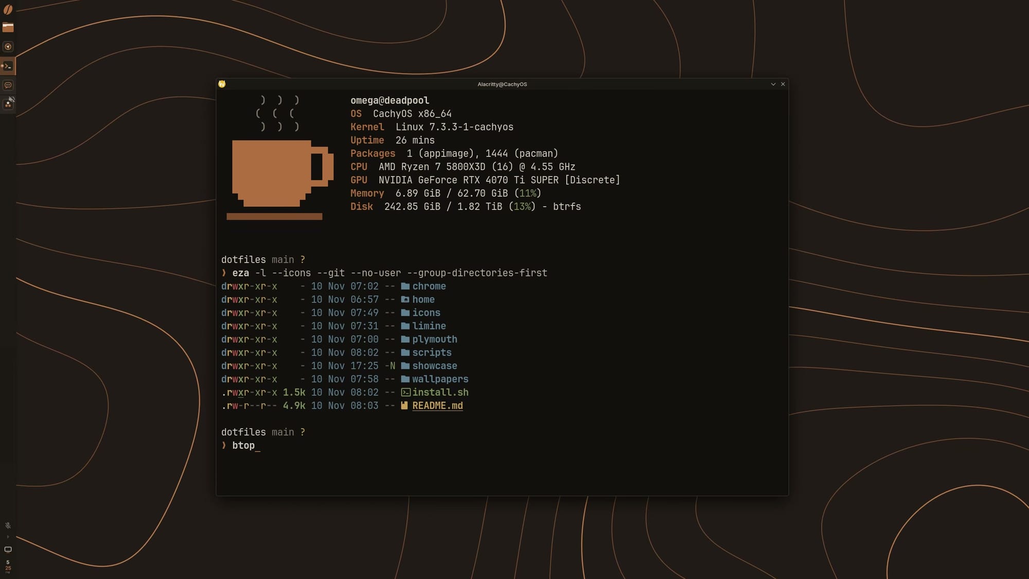
Why brown
Most popular dark themes are built on blue-grey and decorated with pastels. They are well made, and none of them felt like mine. I wanted dark without the candy colours, and I kept coming back to the things on and around my desk: wood, leather, coffee, old brass.
So Walnut starts from black and leans it toward brown. The background is not grey and not quite black. Put it next to a neutral dark theme and you can see the warmth; use it for an hour and it just reads as "dark", only easier to sit in front of at night.
The palette
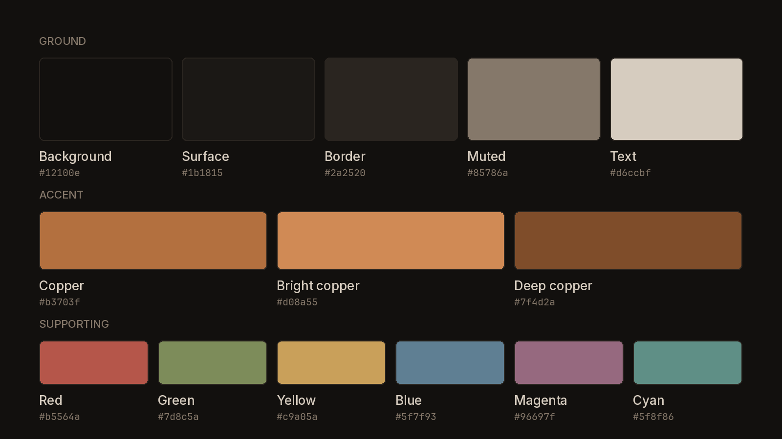
The palette has three parts.
Ground. Five tones run from the background (#12100e) up through a surface and a border to muted text and the main text colour, a warm cream (#d6ccbf). There is no pure black and no pure white anywhere. Every one of the five carries a little brown, which is why they sit together without effort.
Accent. There is one: copper (#b3703f). It marks the thing that matters right now, such as the selected item, the cursor, the minutes on the clock or the prompt. A brighter copper handles highlights and a deeper one handles shadow, but they are the same colour at different strengths, not three accents.
Supporting colours. A terminal needs a red, a green, a yellow, a blue, a magenta and a cyan, so Walnut has them. Each is pulled toward earth: brick for red, olive for green, straw for yellow, slate for blue. They are there to carry meaning (an error, a directory, a changed file) and they stay quiet next to the copper.
The rules
A palette is only half of a style. The other half is what you agree not to do. Walnut has five rules.
- One accent. If two things on screen are copper, one of them is wrong.
- Lines over fills. Shapes are drawn with thin strokes on a dark ground. Large blocks of colour are rare, so the few that exist stand out.
- Flat. No gradients, no glow, no glass, no blur.
- Quiet edges. Windows have no coloured borders. A border is one step lighter than the surface it sits on.
- Two typefaces. Inter for the interface, JetBrains Mono for anything in a terminal.
Icons
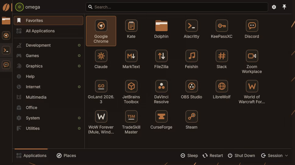
App icons are the loudest thing on most desktops. Every app arrives with its own colours and its own shape, and a row of them looks like a shelf of cereal boxes. Walnut redraws them to one recipe: a dark rounded tile, a hairline outline, a copper glyph, and at most one cream detail.
The glyph says what the app does, not what its logo looks like. The text editor is a notepad. The music player is a note. The terminal is a prompt. Folders break the tile rule and are solid copper, because folders are the one thing you look for by shape and colour before you read a name.
At small sizes the tile drops away and only the glyph is left, so a tray icon stays legible at the size of a fingernail.
The wallpaper

The wallpaper is a contour map: thin copper lines on the dark ground, with every fifth line drawn a little stronger. It follows the same rule as everything else, lines over fills, and it leaves a lot of empty space for windows to sit in.
I have four monitors of two different sizes, and the map is drawn once for the whole desk. Each screen shows its own piece, placed by the real position of the glass, so a line that runs off the edge of one monitor picks up on the next one where you would expect it to. It also moves. The lines drift slowly enough that you never catch them at it; you just notice an hour later that the hills are somewhere else.
Carrying it through
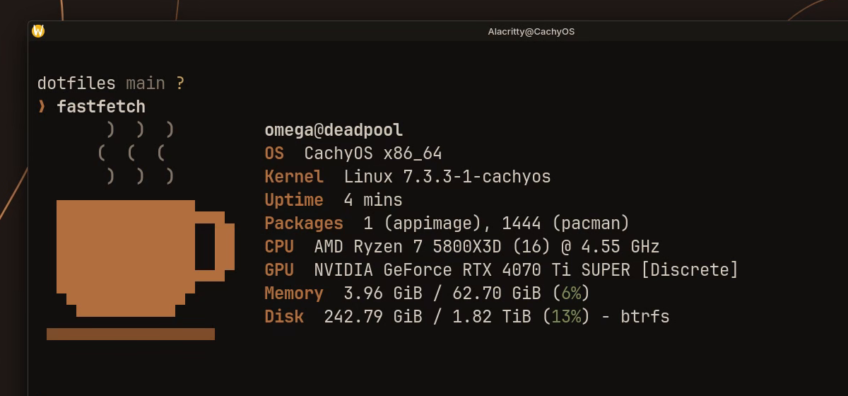
What makes a theme feel finished is the lack of seams. The boot menu, the loading screen, the login screen, the desktop, the terminal, the browser and the keys on my Stream Deck all use the same ground and the same copper. Nothing flashes white on the way in, and no app shows up dressed for a different party.
There is one running joke. The launcher button is a coffee bean, and the terminal greets me with a coffee cup. Brown had to come from somewhere.
The panel clock shows how the rules play out in one small object. It sits in a narrow vertical bar, so it stacks: the hour in cream, the minutes in copper below it. Two numbers, one accent, nothing else.
What's next
Walnut started as a colour scheme for one desktop and has turned into a small design system. The next place it is going is this blog.